In today’s world, data is everywhere. It’s easier than ever to collect data, and there is an ever-expanding collection of platforms on which to record it. But gleaning insights and making business decisions off of data that is represented in rows and columns is archaic and inadvisable. That is why many business use dashboards to visualize their data in different ways, allowing decision-makers to spot trends and patterns more quickly and clearly than through simple spreadsheets. There is no business or industry that can’t benefit from visualizing their data, but Manufacturers are the one group that can’t survive without it. For manufacturers churning out hundreds of thousands of products per day, a 0.5% change in operations could potentially mean a savings or cost of thousands—or even millions—of dollars.
Dashboards allow managers to track important metrics and KPIs that align with business objectives and help them assess how far or close they are to their target. They are the tool we use to uncover actionable insights that help the business grow and actually stay in business. As the saying goes, “If we can’t measure it, we can’t improve it”. And yet it is baffling that many businesses choose to ignore the importance of data visualization and operate without this essential decision-making tool.
Not all manufacturers are created equal. There are many different types, and they all have different products and processes. However, many of them track a lot of the same metrics and KPIs. According to a survey conducted by Schenck in 2013, these are some of the most common metrics used by manufacturers:
- Sales
- Quality
- Delivery Performance
- Safety
- Downtime
- Reject/Scrap
- Material Cost
- Production Output
Using these common metrics, we will explore a few different dashboards that help keep track of these important measures.
The Quality Performance Dashboard
In a fully globalized and open world, quality in manufacturing is paramount to survival for any company. If a manufacturer doesn’t monitor its defective rate or fail rate, its costs rise as they have to accommodate the customer with a replacement product and try to recover the defective unit.

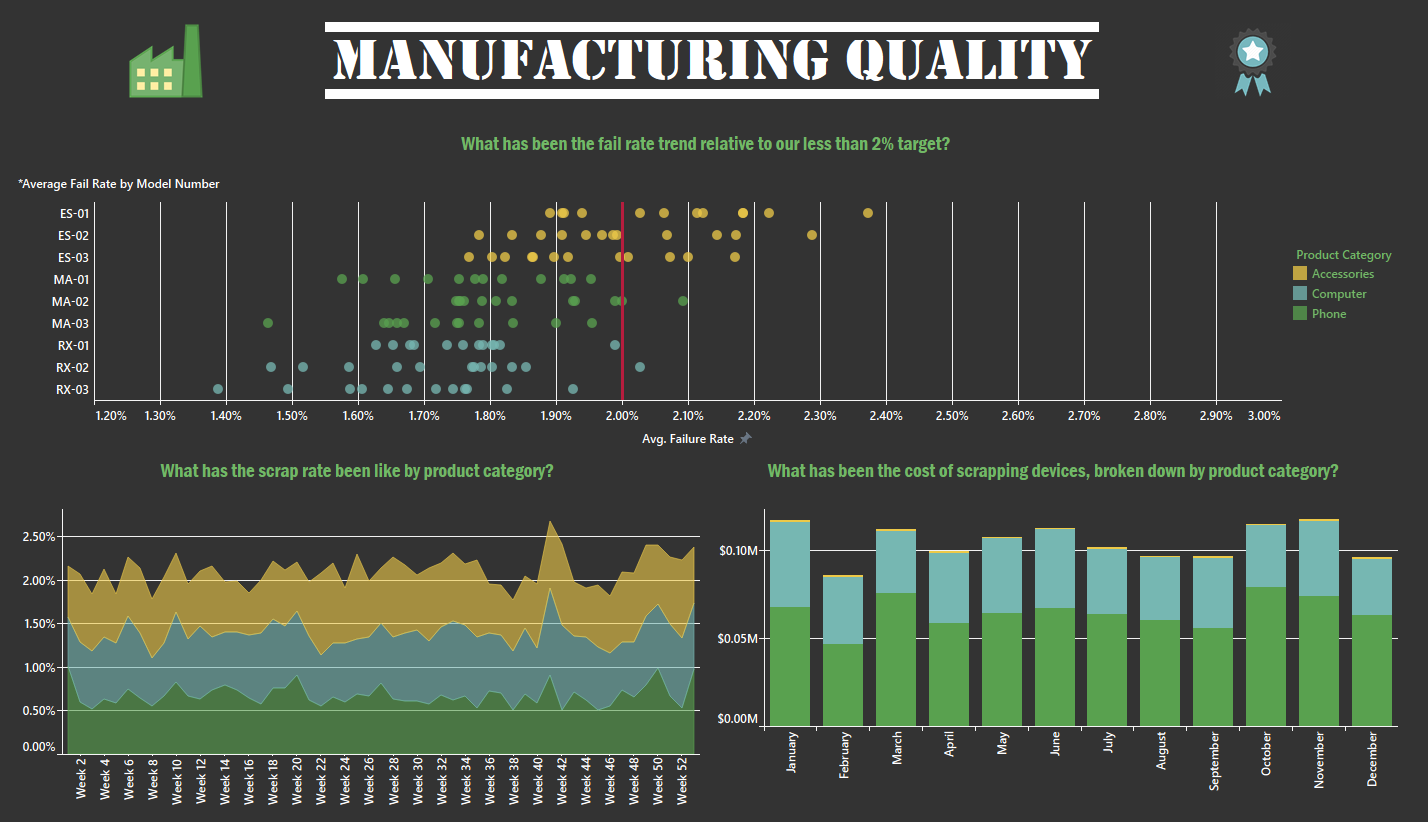
This dashboard tracks the Average Fail Rate (AFR), Scrap Rate (SR), and Scrap Cost (SC) for a sample manufacturer. In the AFR view, the manufacturer has established a target fail rate to stay under at 2%. All the data points to the right represent batches that exceed this target by product.
The SR view monitors the rate at which the failed or defective units are scrapped. The goal here is to monitor how efficient the company is in recovering defective units and refurbishing them to keep the scrap rate low. A high scrap rate indicates money being wasted on trying to recover material that ends up being scrapped.
Finally, the SC view records the implications of a higher scrap rate. If for example, Company XYZ knows that their average fail rate is 2% on all units produced and that of those 2% they will end up scrapping on average 0.5%, they may be able to properly budget for these future costs. However, if the fail rate exceeds the 2% threshold and/or the scrap rate is higher than expected, then the scrap cost will likely be much higher than expected.
In sum, this dashboard does a good job of monitoring overall quality for a manufacturer.
Production Downtime & Performance Dashboard
Another important process manufacturers like to monitor is the performance of their production lines.

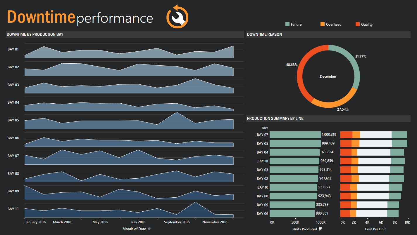
This dashboard tracks Downtime by Bay (DB), Downtime Reason (DR), and Production Line Summary (PLS).
The DB view tracks downtime by minutes of each bay in a production facility. This view can be useful in uncovering any trends or revealing any bays that may be frequently breaking down or experiencing other type of issues.
The DR view simply provides the reasons for the downtime for each bay. For example, Bay 07 experienced over fifteen thousand minutes of downtime in 2016 with Failure (red) and Quality (green) being the main culprits for the stoppage in production.
Lastly, the PLS view summarizes efficiency by showing which bays were the most productive over the year and what the average cost of each unit was considering downtime costs as a factor.
Delivery Performance Dashboard
When retailers purchase from manufacturers, they expect delivery within a certain time frame so they can plan to make space for the incoming goods. It is very important for manufacturers to keep their clients happy by delivering their products to them on-time.

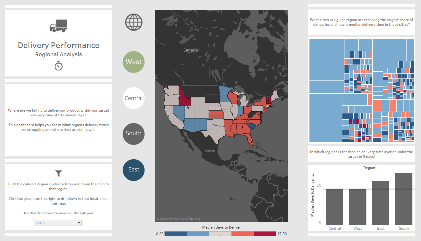
This dashboard tracks company XYZ’s delivery performance for 2015. Assuming a target delivery time of 9 days, the states in red are the ones that had a median delivery date of over 9 days for 2015. This type of visualization is good for tracking patterns to determine if the delivery issue is regional or not. As you can see from this Delivery Map view, company XYZ had a difficult time meeting its delivery target in the South and Northeast regions but did fairly well on the West Coast. This could lead management to review the carriers in that area or plan better for weather.
Median Days to Delivery simply sums up by region the aggregate median delivery performance. This reiterates how the South and Northeast were missing the mark, with the South overall missing the target by a few days.
The last view, City Delivery Performance, provides a more granular view of delivery performance. The size of the box indicates the cities with more incoming orders and the color signifies whether delivery was within the target of 9 days (blue) or delivered after 9 day target (red). As you can see, Company XYZ actually did a good job at fulfilling delivery to the retailers in the bigger cities and struggled getting goods out to the more rural locations which had a smaller number of orders.
Safety Dashboard
Last but not least, one thing manufacturers are particularly interested in is operating a safe working environment. Manufacturing facilities can often contain dangerous, industrial machines that could injure employees if proper steps are not taken. Plant managers want to ensure that there are no dangerous safety trends showing up in their facilities.

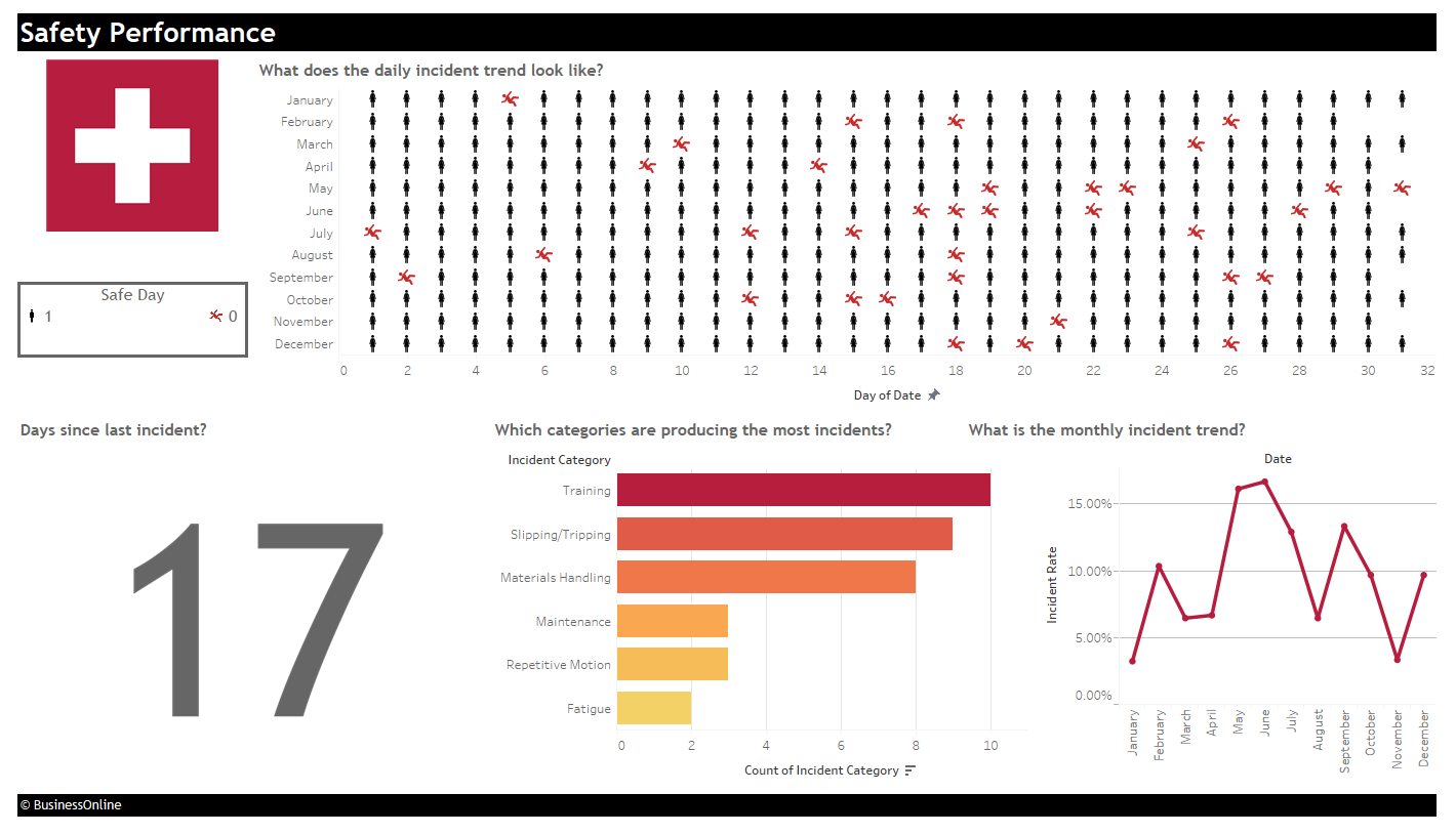
This is a pretty simple yet important visualization. The main visualization at the top shows a daily count of days that were incident free vs days where there was an incident. A black figure means no incidents reported that day, while a red figure shows there was an incident that day. This is something many manufacturers track for compliance reasons.
The bar graph shows the total count of incidents for the given year, broken down by color on category. You can see that in this year, Training (red) was the leading category for incidents. Perhaps safety during training sessions needs more attention?
The view on the bottom right simply tracks the incident rate, which can help reveal if there have been improvements in safety or if conditions are worsening. Lastly, the number on the left shows the number of consecutive days without any incidents. Here we see it has been 17 days with no issues!
Conclusion
Dashboards are critical for every business, but even more so for manufacturers. Operating without them makes conceptualizing hard numbers more difficult and opens up the chance of missing patterns that would be more obvious if visualized. They are an important tool for any decision maker and help drive and guide the business in the right direction.
Here at BusinessOnline, we leverage our Technology-Enabled Marketing Service, Data Weld, to help marketers in the manufacturing industry prove & improve Marketing’s return on investment. As a partner of the Manufacturers Alliance for Productivity and Innovation, we help build & execute on digital marketing strategies for manufacturers that are looking to create demand generation and help justify marketing’s efforts through marketing analytics.
To learn more about how digital marketing will drive manufacturers destiny, please check out our Invent to Survive Guide: Learn How Global Manufacturing Leaders are Innovating with Digital: http://marketing.businessol.com/invent-to-survive.html
Other Related Manufacturing Resources:
- Top 5 Marketing Challenges in Manufacturing: http://marketing.businessol.com/top-five-marketing-challenges-in-manufacturing.html
- Leveraging 3rd Party Data: http://marketing.businessol.com/leveraging-third-party-data-to-drive-marketing-results.html
- To learn more about our Technology-Enabled Marketing Service, please check out http://www.dataweld.net/
